Index Surge: Amplifying Your Insights
Stay updated with the latest trends and news across various industries.
Typographic Treasures: Crafting Web Wonders
Unleash your creativity! Discover tips and tricks for crafting stunning web typography that captivates and inspires in Typographic Treasures.
The Art of Typography: Elevate Your Web Design
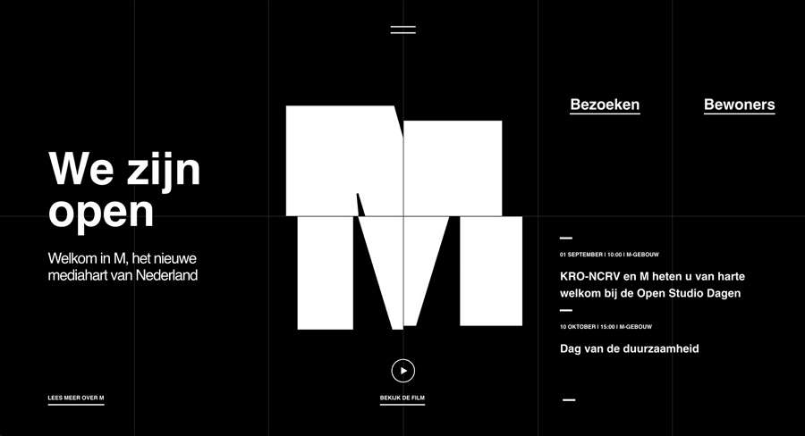
Typography is more than just the arrangement of text on a page; it is an art form that can elevate your web design to new heights. Effective typography guides the reader's eye, creates a hierarchy of information, and instills a sense of brand identity. By using a combination of font styles, sizes, and colors, web designers can evoke emotions and enhance user experience. The right choice of typography can transform an ordinary website into a visually captivating online presence, making it crucial for any web designer to master this art.
When considering the impact of typography in web design, there are several key elements to keep in mind:
- Readability: Ensure your text is easy to read on various devices.
- Contrast: Use contrasting colors to make text stand out.
- Font Pairing: Choose complementary fonts to create visual interest.
- Sizing: Adjust font sizes for different headings and body text to establish a clear hierarchy.

Essential Typography Tips for Creating Stunning Websites
Typography plays a crucial role in web design, as it not only enhances aesthetics but also improves user experience. When designing a website, it's essential to choose the right font that aligns with your brand’s identity. Opt for easy-to-read fonts and maintain a sufficient contrast between the text and background. Establishing a clear typographic hierarchy can guide users through your content seamlessly. For instance, using headings (H1, H2, H3) effectively helps in organizing information and allows readers to skim through the text efficiently. Additionally, limit the number of different fonts to two or three, as too many can create visual clutter and distract visitors.
Another critical tip is to pay attention to line spacing and letter spacing. Properly spaced text enhances readability, making it easier for visitors to engage with your content. Aim for a line-height of 1.5 for body text, which gives it breathing room and increases comprehension. Furthermore, use responsive typography to ensure your text looks great on all devices. With the growing use of mobile browsing, implementing CSS techniques such as vw (viewport width) units can help maintain the visual appeal of your typography across various screen sizes. By following these tips, you can create a stunning website that captivates your audience and keeps them engaged.
How to Choose the Perfect Font Pairings for Your Web Projects
Choosing the perfect font pairings for your web projects is essential to create a visually appealing and harmonious design. Start by understanding the basic principles of typography, including contrast, hierarchy, and readability. A good rule of thumb is to select one display font for headlines and one body font for paragraphs. Display fonts are typically more decorative and should be used sparingly to draw attention, while body fonts need to be clean and easy to read. Consider using a tool like Google Fonts, which offers an extensive library of typefaces and allows you to preview various combinations.
When pairing fonts, aim for a balance of font styles and weights. It’s important to choose fonts that complement each other rather than compete for attention. For example, pairing a serif font with a sans-serif font can create a visually pleasing contrast. Additionally, pay attention to font size and spacing to ensure optimal readability across different devices. As you experiment with different combinations, don't hesitate to test your selections in real-world contexts, such as mock-ups or prototypes, to see how they perform together in your specific design.