Index Surge: Amplifying Your Insights
Stay updated with the latest trends and news across various industries.
Type With Impact: Transforming Your Website One Font at a Time
Transform your website's look and feel with impactful typography tips. Elevate user experience and attract more visitors today!
Choosing the Right Font: A Guide to Enhancing Your Website's Aesthetic
Selecting the right font for your website is crucial for creating an appealing aesthetic that enhances user experience. The font you choose can significantly influence the readability of your content and the overall impression your site makes. Consider factors such as font style, size, and weight when making your choice. For instance, a clean sans-serif font may convey a modern and approachable vibe, while a serif font may evoke a sense of tradition and reliability. Here are a few tips to guide your selection:
- Identify your target audience and their preferences.
- Keep branding consistency in mind.
- Ensure readability across all devices.
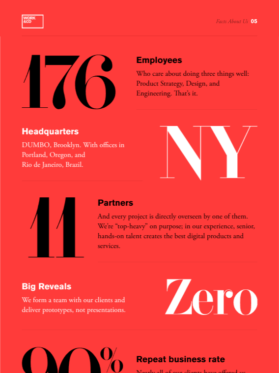
Once you've narrowed down your choices, remember that the effective use of font pairing can further elevate your website's design. Combining a decorative header font with a simple body text font can create a pleasing contrast that captures attention without overwhelming the reader. Moreover, maintaining a limited font palette—typically no more than two or three fonts—can help maintain cohesion throughout the site. Always test your selected fonts on various screens and resolutions to ensure they deliver a consistent and effective aesthetic experience that ultimately encourages visitors to stay longer and engage more with your content.

The Psychology of Typography: How Font Choices Impact User Experience
The psychology of typography plays a crucial role in determining how users interact with content. The choice of font can evoke different emotions and convey varying degrees of trust and reliability. For instance, serif fonts such as Times New Roman are often associated with tradition and professionalism, making them suitable for formal communications. In contrast, sans-serif fonts like Arial and Helvetica tend to create a more modern and approachable feel, which can enhance user engagement. Understanding these nuances allows designers to tailor their font choices to better resonate with their target audience.
Moreover, font legibility significantly impacts user experience. Research indicates that typographic hierarchy—the arrangement of fonts, sizes, and weights—helps guide readers through the content and makes information easier to digest. For example, using larger, bolder fonts for headings and smaller fonts for body text can effectively draw attention to key points. Additionally, adequate line spacing and contrast between text and background make a website more accessible, ensuring that users are not only drawn in but also retained. Ultimately, thoughtful font selection is essential for enhancing usability and creating an inviting atmosphere for visitors.
Are You Using the Best Fonts for Your Brand? Key Factors to Consider
Choosing the right fonts for your brand is more than just a matter of aesthetics; it plays a crucial role in shaping your brand identity and communicating your message effectively. When selecting fonts, consider factors such as readability, legibility, and alignment with your brand's personality. For example, a tech company might opt for sleek, modern fonts, while a luxury brand might choose elegant, serif fonts. Additionally, ensuring consistency across all platforms and materials can help reinforce brand recognition.
Moreover, it's important to think about font pairing—the art of combining different fonts to create a cohesive look. Aim for a maximum of two to three fonts that complement each other and reflect your brand's tone. Remember to consider your audience's preferences as well, as different demographics may respond better to certain styles. By taking these key factors into account, you can ensure that you are using the best fonts for your brand, effectively conveying your message and enhancing your overall brand image.