Color Your World: Why Your Website's Palette Matters
Discover how the right color palette can elevate your website, boost engagement, and leave a lasting impression. Unleash your site's true potential!
The Psychology of Color: How Your Website's Palette Affects User Behavior
The Psychology of Color plays a crucial role in determining how users engage with your website. Different colors evoke distinct emotions and associations, influencing user behavior subconsciously. For instance, blue is often associated with trust and reliability, making it an excellent choice for brands aiming to establish credibility. On the other hand, red can create a sense of urgency, prompting users to take immediate action, such as making a purchase. Understanding these psychological impacts allows web designers to strategically select a color palette that resonates with their target audience, ultimately enhancing user experience and driving conversions.
Moreover, the effect of color extends beyond mere aesthetics; it also impacts how visitors navigate your site. Studies have shown that users are more likely to engage with calls-to-action that utilize contrasting colors, making them stand out on the page. For example, using a bold orange for a 'Buy Now' button against a cool-toned background can significantly increase click-through rates. By thoughtfully incorporating color psychology into your website's design, you’re not only enhancing visual appeal but also guiding user behavior in a way that aligns with your business goals.
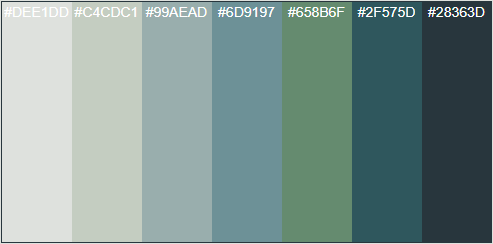
5 Essential Tips for Choosing the Perfect Color Scheme for Your Website
Choosing the right color scheme for your website is crucial for creating a visually appealing environment that enhances user experience. Here are 5 essential tips to help you select the perfect palette:
- Understand Your Brand Identity: Your color choices should reflect your brand’s personality. Think about the emotions you want to evoke and select hues that align with those feelings.
- Consider Color Psychology: Colors can influence how visitors perceive your website. For example, blue often conveys trust and professionalism, while orange can evoke excitement and creativity. Make sure to leverage these psychological effects when choosing your color scheme.
When creating your color scheme, balance is key. Utilize a mix of dominant, secondary, and accent colors to guide users’ attention throughout your site. Here are a couple more tips:
- Limit Your Color Palette: Aim for a cohesive look by selecting a limited color palette—typically, 3 to 5 colors work best.
- Test Your Combinations: Before finalizing your color choices, run tests to see how they look together and how they impact usability. A well-executed color scheme can directly enhance user engagement and retention.
Is Your Website's Color Palette Working for You? Key Signs to Look Out For
When evaluating whether your website's color palette is working for you, it's essential to consider how these colors align with your brand identity and overall user experience. A successful color palette not only reflects your brand's personality but also influences user emotions and actions. For example, warm colors like red and orange can evoke feelings of excitement and urgency, while cool colors like blue and green generally promote calmness and trust. Pay attention to the following key signs that indicate your palette might need a refresh:
- High bounce rates on landing pages.
- Low conversion rates on call-to-action buttons.
- Negative user feedback regarding visual appeal.
In addition to these metrics, analyzing user engagement through A/B testing can yield valuable insights. If users seem to favor certain color schemes over others, it may signal that your current palette is not resonating. Moreover, consider how your colors affect accessibility and readability. Websites that utilize contrasting colors effectively tend to offer a better user experience for individuals with visual impairments. To ensure your website's color palette is truly working for you, keep an eye on these vital indicators:
- Readability and text contrast.
- User feedback on color preferences.
- Alignment with current design trends.